The University has revealed its brand refresh in anticipation of UCL200
Rebekah Wright
Editor-in-Chief
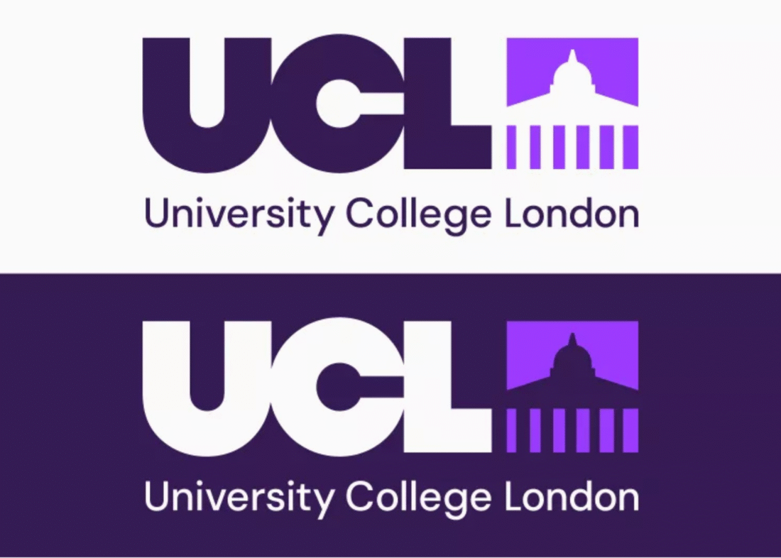
UCL's logos for dark and light backgrounds. Credit: Brand and Experience at UCL
A rebrand for UCL has been launched preceding the University’s 200th anniversary celebrations in February.
UCL claims that “accessibility” has been central to the rebrand, recognising that, despite the University’s success in global rankings, it lacks the international brand recognition of some competitors.
“University College London” is to now be included in full on all external communications since the acronym is not always recognisable.
Versions of the logo with the full name underneath are also available for this purpose, as are single-colour versions and designs for use on dark and light backgrounds.
The new logo in its dark purple and white versions
The new logo was launched on the UCL website today, informed by feedback from over 7100 community members who advocated for a branding change that presents UCL as a “platform for possibility”.
The rebrand also includes a new tagline, “Here it can happen”, replacing the more distinctive “Disruptive thinking since 1826”. The new tagline, however, does match the Students’ Union branding, “Where more happens”.
The first rebrand in 20 years will be rolled out in phases, beginning with banners on Gordon Street and around the Main Quad once renovations are finished in January, provided UCL keeps toschedule.
The new logo with UCL spelled out in full
Students initially ambivalent
Students had varying opinions on the brand update, with one claiming “there was nothing wrong with the old logo but the new one is also not terrible”.
They went on to say that “the little design picture itself is kind of cool. I like that. But the purple is a bit ugly and it looks better as black and white”.
Another espoused a similar view, telling The Cheese Grater, “they’re right about some people not know[ing] what UCL stands for but there’s got to be a better way to publicise ourselves, but I guess the full name logo is a step”.
Not everyone saw the innovation in the new design, though. An alumnus told us, “nothing says UCL more than using another default font from Google Docs for their branding and hoping no one would notice – at least it’s not Arial anymore”.
The newtypeface, dubbed UCL Sans, is a slightly adapted version of the Google font DM Sans made to be more accessible.
UCL tote bag or Elizabeth Line moquette tote bag? UCL's new "graphic pillars" in action
Will they fix UCL Accommodation now?
Another concern raised was the funding that has been funnelled into UCL200, with a third student asking, “is it really worth it to do all this rebranding when there are a lot of other coreissues that the University needs to fix, which they could do with that money.”
A different student similarly suggested that “it’s going to be expensive for no reason because it looks the same”, accompanied by the outlandish remark that the new Portico logo “looks like an octopus became a UFO”.
However, the rebrand has been received positively in the Students’ Union, with President Anam Choudhary asserting that “UCL’s new brand feels powerful and full of potential. We’re a top global university and need to be bold about telling that story”.
UCL society presidents also received an email from the Students’ Union today encouraging them to “support the roll-out by championing the refreshed brand. Help get your community excited about it”.
Low bar…
The unfamiliarity of a rebrand can make them unpopular. In March 2024, Imperial College London sawnearly 5000 people sign a petition asking them to reverse their logo change following claims it was “ugly” and had connotations of imperialism after “College London” was omitted.
Initial reactions suggest that UCL has avoided a response quite this severe as another student concluded: “at least [the rebrand] looks better than Imperial’s”.
UCL200 graphics and merchandise
Dr Michael Spence, UCL President and Provost, said:
“UCL has been defined by bold thinking and real-world impact, as the first university in London, the first to welcome people of all faiths, and the first to welcome women to university education.
“Our refreshed brand captures that innovative spirit. As we look to our bicentenary and beyond, I look forward to seeing this new visual and verbal identity being introduced consistently across UCL, strengthening recognition of this incredible institution and fantastic community that makes great things happen.”